Homer2 needs a particular format of a .nirs file that cannot have consecutive triggers (also called Marks in Hitachi files).
hitachi2nirs Matlab script also removes the markers but I wanted to recreate the whole process and be sure that I’m doing it correctly. Answering Yes to the question Do you want to remove the marker at the end of each stimulus? y/n will run the following code:
To remove the triggers/markings in R follow the steps below.
Start with loading the packages and files
This will produce a table showing a structure
## 'data.frame':    2500 obs. of  50 variables:

##  $ Probe1      : int  1 2 3 4 5 6 7 8 9 10 ...

##  $ CH1.703.6.  : num  0.1865 0.0182 -0.4738 -0.1521 -0.3078 ...

##  $ CH1.829.0.  : num  0.412 0.547 0.534 0.314 0.106 ...

##  $ CH2.703.9.  : num  0.739 0.764 0.746 0.751 0.762 ...

##  $ CH2.829.3.  : num  1.01 1.01 1.03 1.03 1.03 ...

##  $ CH3.703.9.  : num  1.57 1.58 1.59 1.59 1.6 ...

##  $ CH3.829.3.  : num  1.64 1.65 1.65 1.66 1.67 ...

##  $ CH4.703.9.  : num  1.48 1.45 1.55 1.51 1.47 ...

##  $ CH4.828.8.  : num  1.63 1.64 1.66 1.66 1.68 ...

##  $ CH5.703.6.  : num  -1.226 -1.743 -0.546 -0.556 -0.75 ...

##  $ CH5.829.0.  : num  0.00397 -0.23102 -1.11099 -0.64056 -1.01425 ...

##  $ CH6.703.1.  : num  -0.247 -0.335 -0.371 -0.667 -1.064 ...

##  $ CH6.828.8.  : num  0.987 0.892 0.892 0.933 0.796 ...

##  $ CH7.703.9.  : num  1.03 1.3 1.11 1.02 1.44 ...

##  $ CH7.829.3.  : num  1.2 1.22 1.21 1.23 1.23 ...

##  $ CH8.702.9.  : num  2 2.01 2.03 2.04 2.04 ...

##  $ CH8.829.0.  : num  1.79 1.81 1.81 1.83 1.85 ...

##  $ CH9.703.9.  : num  2.07 2.02 2.12 2.12 2.01 ...

##  $ CH9.828.8.  : num  1.82 1.82 1.82 1.84 1.85 ...

##  $ CH10.703.1. : num  -0.492 -0.135 -0.598 -0.598 -0.328 ...

##  $ CH10.828.8. : num  0.672 0.61 0.823 0.724 0.724 ...

##  $ CH11.703.1. : num  -1.042 -0.255 -1.773 -1.419 -0.449 ...

##  $ CH11.828.8. : num  1.071 1.052 0.804 1.107 1.047 ...

##  $ CH12.702.9. : num  0.684 0.771 0.704 0.512 0.905 ...

##  $ CH12.829.0. : num  1.02 1.01 1.03 1.08 1.07 ...

##  $ CH13.702.9. : num  2.03 2.03 2.05 2.05 2.05 ...

##  $ CH13.829.0. : num  1.76 1.78 1.79 1.79 1.81 ...

##  $ CH14.703.6. : num  -1.719 -1.196 -0.359 -0.883 -1.99 ...

##  $ CH14.829.0. : num  -0.0832 0.0209 -0.1123 -0.2014 -0.2011 ...

##  $ CH15.703.1. : num  1.97 1.89 1.82 1.98 2.09 ...

##  $ CH15.828.8. : num  1.81 1.78 1.8 1.81 1.84 ...

##  $ CH16.703.4. : num  0.0209 -0.4283 -0.0848 -0.278 0.4996 ...

##  $ CH16.829.0. : num  1.36 1.26 1.38 1.23 1.27 ...

##  $ CH17.702.9. : num  2.35 2.35 2.36 2.37 2.38 ...

##  $ CH17.829.0. : num  2.08 2.09 2.11 2.12 2.13 ...

##  $ CH18.703.6. : num  2.1 2.1 2.09 2.1 2.1 ...

##  $ CH18.828.5. : num  2.14 2.14 2.14 2.15 2.15 ...

##  $ CH19.703.6. : num  -1.104 -1.134 -0.658 -0.886 -0.336 ...

##  $ CH19.829.0. : num  -0.1239 0.09369 0.05463 0.01617 -0.00427 ...

##  $ CH20.703.4. : num  1.65 1.55 1.28 1.35 1.56 ...

##  $ CH20.829.0. : num  1.77 1.75 1.8 1.81 1.8 ...

##  $ CH21.703.4. : num  1.41 1.43 1.31 1.42 1.46 ...

##  $ CH21.829.0. : num  1.76 1.77 1.76 1.77 1.79 ...

##  $ CH22.703.6. : num  2.11 2.29 2.18 2.24 2.21 ...

##  $ CH22.828.5. : num  2.17 2.17 2.18 2.17 2.2 ...

##  $ Mark        : int  0 0 0 0 0 0 0 0 0 0 ...

##  $ Time        : num  0 0.1 0.2 0.3 0.4 0.5 0.6 0.7 0.8 0.9 ...

##  $ BodyMovement: int  0 0 0 0 0 0 0 0 0 0 ...

##  $ RemovalMark : int  0 0 0 0 0 0 0 0 0 0 ...

##  $ PreScan     : int  1 1 1 1 1 1 1 1 1 1 ...
table of triggers
## .
## 1 2 9 10
## 73 10 4 2
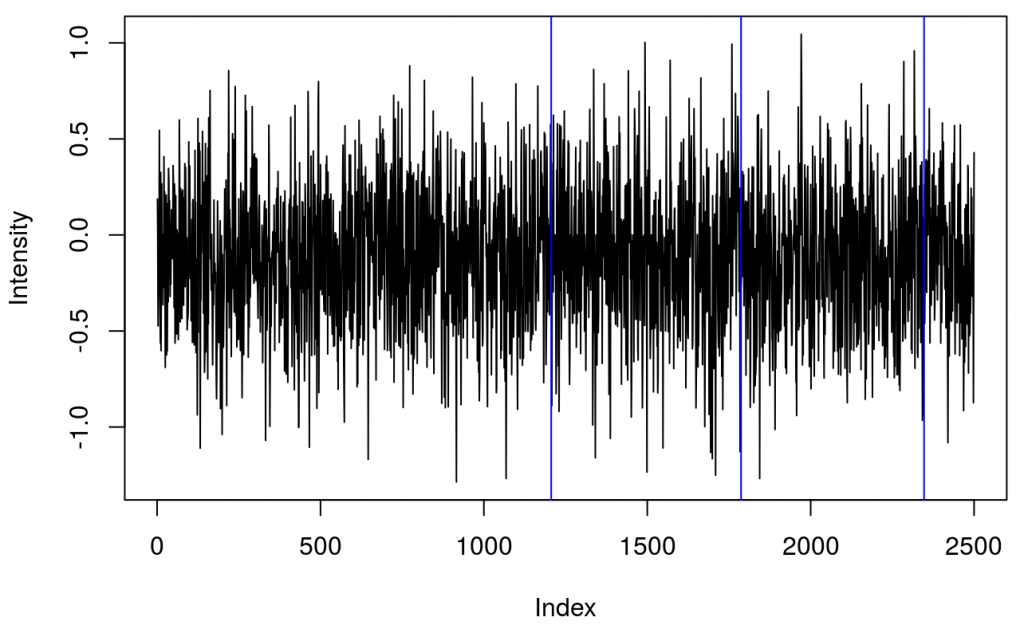
and a plot showing raw data in one channel (quite noisy) with all the triggers.

This shows several triggers (all plotted using red colour). I will only keep trigger ‘2’ to mark the beginning of a block. The first step is cleaning the data by removing all but trigger ‘2’.
Which results in fewer events

It turned out that there were two ‘2’ triggers next to each other. That’s because ETG-4000 does not allow odd triggers next to each other, e.g. 212 is invalid, but 22111122 is valid. I wrote a function (soon incorporated into fnirsr package) that deals with this problem.
The result, only the first block events, is here