Geofacet Polski - wykresy w miejscu województw

Niedawno odnalazłem ciekawy pakiet geofacet, który umożliwia rozmieszczenie wykresów zgodnie z ich pozycją na mapie. Główna funkcja facet_geo() zastępuje facet_wrap() z ggplot2. Polska mapa jeszcze nie jest dostępna w standardowym pakiecie geofacet, ale mam nadzieję, że już wkrótce tam się znajdzie, bo dodałem ją na GitHubie.

Stworzyłem siatkę z koordynatami poszczególnych województw. Wykresy z pakietem geofacet mogą wyglądać tak:


Rozmieszczenie województw nie jest idealne, ale pakiet geofacet umożliwia użycie własnych ustawień.

Dane pochodzą z Banku Danych Lokalnych (XLS - tablica przestawna)

Kod do stworzenia wykresów:

Downloading UK property prices from Zoopla in R

Zoopla allows a limited access to its API providing the latest property prices and area indices. I created a package in R that allows querying this database. See the GitHub documentation or zooplaR’s page for the latest info.

You can easily get prices in the last couple of months or years for a particular postcode, outcode or area:

Given, the limit number of queries, it might be worth double-checking the results with the property widget offered by Zoopla (redirects to zoopla.co.uk).

It doesn’t have as many options as the API and obviously is not automatic but it’s worth using for a sanity check.

How to add code coverage (codecov) to your R package?

During the development of another R package I wasted a bit of time figuring out how to add code coverage to my package. I had the same problem last time so I decided to write up the procedure step-by-step.

Provided that you’ve already written an R package, the next step is to create tests. Luckily, devtools package makes setting up both testing and code coverage a breeze.

Let’s start with adding an infrastructure for tests with devtools:
library(devtools)
use_testthat()

Then add a test file of your_function() to your tests folder:
use_test("your_function")

Then add the scaffolding for the code coverage (codecov)
use_coverage(pkg = ".", type = c("codecov"))

After running this code you will get a code that can be added to your README file to display a codecov badge. In my case it’s the following:
[![Coverage Status](https://img.shields.io/codecov/c/github/erzk/PostcodesioR/master.svg)](https://codecov.io/github/erzk/PostcodesioR?branch=master)

This will create a codecov.yml file that needs to be edited by adding:
comment: false
language: R
sudo: false
cache: packages
after_success:
- Rscript -e 'covr::codecov()'

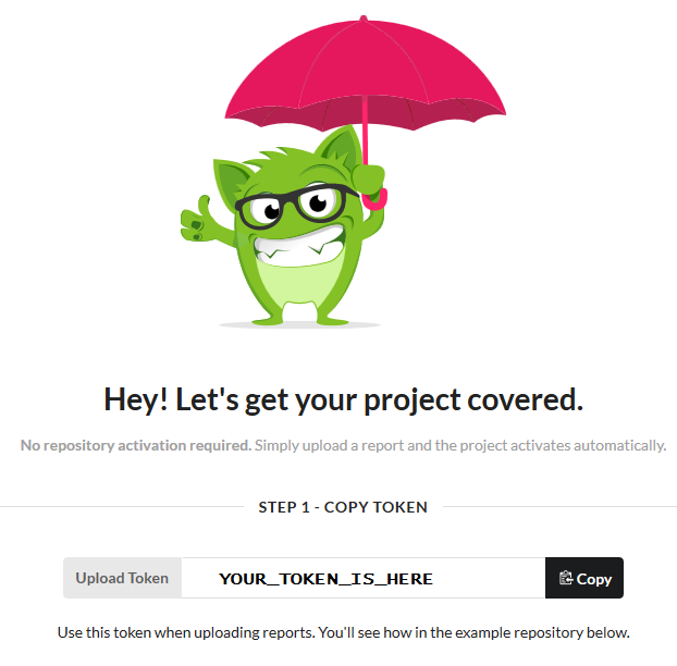
Now log in to codecov.io using the GitHub account. Give codecov access to the project where you want to cover the code. This should create a screen where you can see a token which needs to be copied:

Once this is completed, go back to R and run the following commands to use covr:

install.packages("covr")
library(covr)
codecov(token = "YOUR_TOKEN_GOES_HERE")

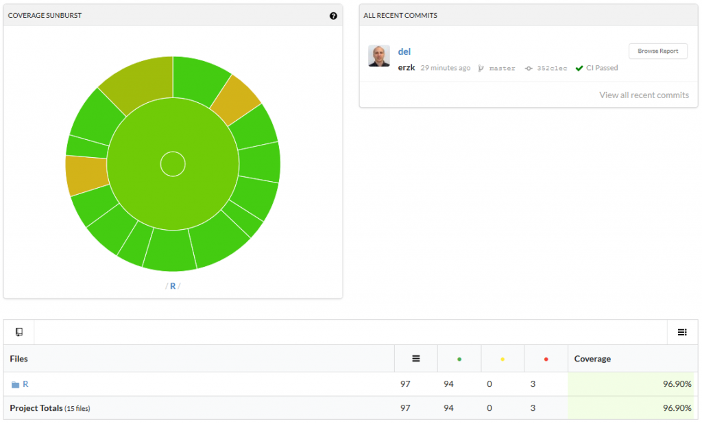
The last line will connect your package to codecov. If the whole process worked, you should be able to see a percentage of coverage in your badge, like this:

Click on it to see which functions are not fully covered/need more test:

I hope this will be useful and will save a lot of frustrations.

Interactive plot of fNIRS data

The easiest way to plot ETG-4000 data in R is by using plot_ETG4000() from fnirsr package. However, if you want to explore your data in more detail, then an interactive plot is more appropriate.

I used dygraphs package to create the chart below. In case of using many channels, the colours in the legend can get a bit mixed up like in my example. I haven’t figured out yet how to add a custom colour palette that could deal with multiple channels.

One way or another, this code snippet should be enough to start generating interactive charts. I haven’t added the interactive chart to the main plotting function (i.e. plot_ETG4000) but I might do it in future releases.

The code used to generate the chart is here:

PS: The dygraph generated correctly in the interactive window, when using R notebooks, and when knitting. When I Saved as Web Page from RStudio, I got a header error that I had to clean by removing a tag (<!DOCTYPE html>) from the generated html file.

fnirsr - Fixing bugs, Travis CI, and detrending

I haven’t worked on fnirsr (my R package for analysing fNIRS data) for a while so I thought it’s time for some improvements. I read a great introduction to Travis CI and decided to make it work this time. After running R CMD check (and devtools::check()) several times to fix multiple bugs, I finally got to see that lovely green badge 🙂

The package still needs more testing, but so far it does its job. On top of that, I finally added a function that removes a linear trend from an fNIRS signal:

For more details and the latest updates see the project’s GitHub page.
CRAN, here I come!

fnirsr - An R package to analyse ETG-4000 fNIRS data

As I mentioned in my previous post, I am trying to get my head around analysing fNIRS data collected using Hitachi ETG-4000. The output of a recording session with ETG-4000 can be saved as a raw csv file (see the example). This file seems to be pretty straightforward to parse: the top section is a header, and raw data starts at line 41.

I created a set of basic R functions that can deal with the initial stages of the analysis and I wrapped them in an R-package. It is still a very early alpha (or rather pre-alpha), as the documentation is still sparse and no unit tests were made. I only have several raw csv files and they seemed to work fine with my functions but I’m not sure how robust they are.
Anyway, I think it will be useful to release it even in the early stage and work on the functions as time goes by.

The package can be found on GitHub and it can be installed with the following command:

devtools::install_github("erzk/fnirsr")

A vignette (Rmd) is here.

HTML vignette:

I couldn’t find any other R packages that would deal with these files so feel free to contact me if you work(ed) on something similar. Pull requests are encouraged.

Loading and plotting nirs data in R

Recently I started to learn how to use Hitachi ETG-4000 functional near-infrared spectroscopy (fNIRS) for my research. Very quickly I found out that, as usual in neuroscience, the main data analysis packages are written in MATLAB.

I couldn’t find any script to analyse fNIRS data in R so I decided to write it myself. Apparently there are some Python options, like MNE or NinPy so I will look into them in future.

ETG-4000 records data in a straightforward(ish) .csv files but the most popular MATLAB package for fNIRS data analysis (HOMER2) expects .nirs files.

There is a ready-made MATLAB script that transforms Hitachi data into the nirs format but it’s only available in MATLAB. I will skip the transformation step for now, and will work only with a .nirs file.

The file I used (Simple_Probe.nirs) comes from the HOMER2 package. It is freely available in the package, but I uploaded it here to make the analysis easier to reproduce.

My code is here:

This will produce separate time series plots for each channel with overlapping triggers, e.g.:

The entire analysis workflow:

Other files:
- RMarkdown file
- html report

I hope this helps.
More to follow.

Scraping the Performance History at the Royal Opera House

As a fan of both open data and ROH I was excited to find the article promising that the ROH’s data might be opened. However, this article was published in 2014 and the only open data about ROH that I could find was the Royal Opera House Collections Database. Its format is far from being user-friendly, i.e. there are no cleaned csv (or even xlsx) files, but luckily the structure of the entire website is fairly predictable. This meant I managed to write a basic scraper to extract the high level performance data. Unfortunately the database only contained data for the years 1946-2012.

The result is this interactive dashboard created in Tableau:

Highlights:

    The number of performances in 1993 (159) started to approach the peak previously reached in 1951 (168 performances).
    1998 and 1999 were years when ROH was being reconstructed.
    The matinees started to become more popular in the noughties.
    1968 was the last year of performances as the Covent Garden Opera Company.
    Tosca was the most popular opera in the studied period with 187 performances.
    La bohème was the most popular matinee.
    The Kirov Opera was the third most popular company performing at the ROH with 33 appearances. After the name change to Mariinsky Theatre, there were additional four performances by this company.

Here’s the scraper code:

UK broadband speeds - embedding Tableau dashboards into Rmd files

I found a new dataset about UK broadband speeds and I started analysing it in R. However, after cleaning the data, I thought that creating a dashboard with Shiny would take me too much time so I moved to Tableau. I wanted to keep my analyses in one place so I embedded the dashboard into the output html document (see below).

Initially I thought that RMarkdown can’t generate embedded Tableau visualizations because the iframe in my report seemed blank after knitting the report. I had to open the generated in the browser to see the iframe filled with Tableau dashboard.

RMarkdown file is available here.