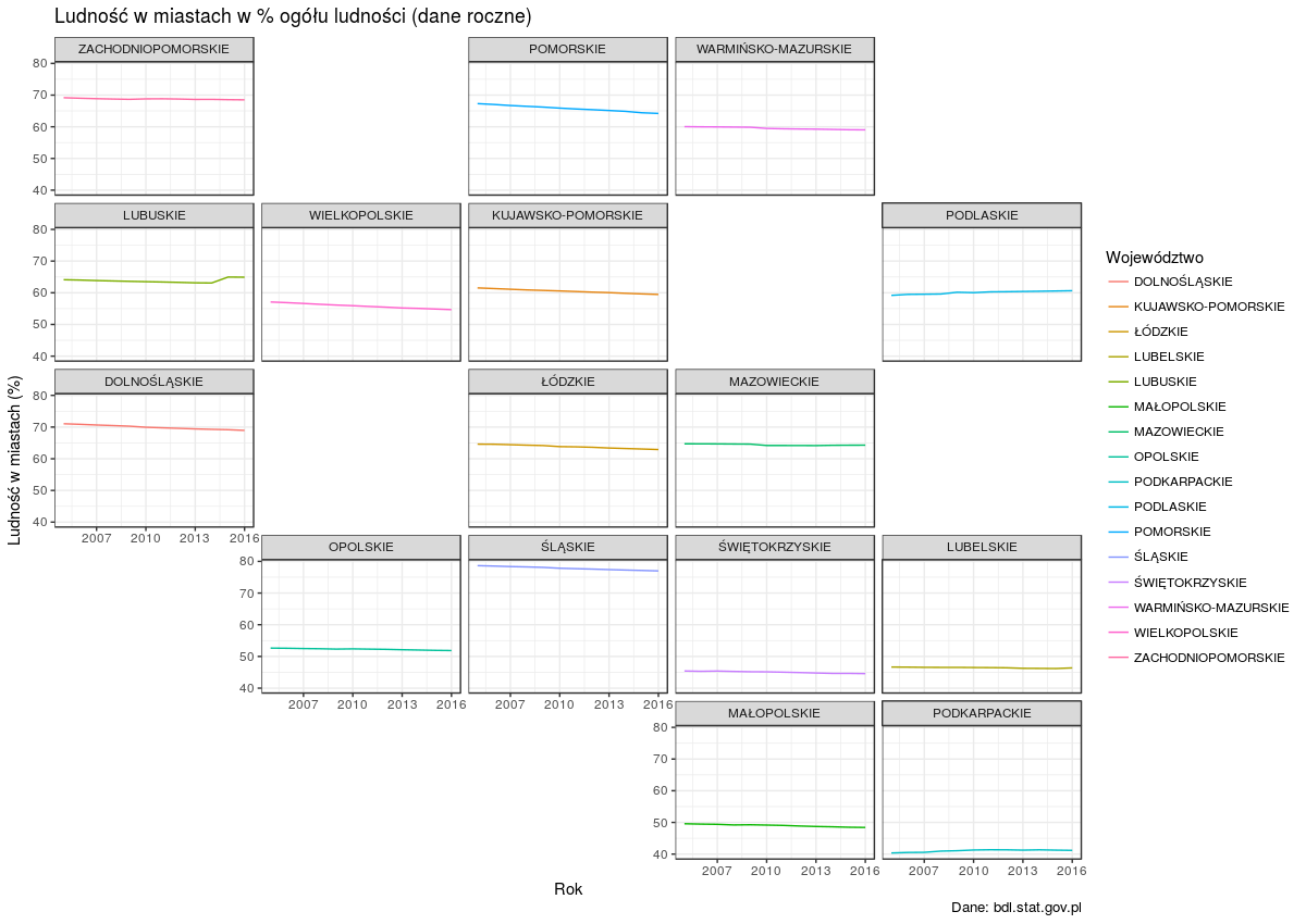
Niedawno odnalazłem ciekawy pakiet geofacet, który umożliwia rozmieszczenie wykresów zgodnie z ich pozycją na mapie. Główna funkcja facet_geo() zastępuje facet_wrap() z ggplot2. Polska mapa jeszcze nie jest dostępna w standardowym pakiecie geofacet, ale mam nadzieję, że już wkrótce tam się znajdzie, bo dodałem ją na GitHubie.
Stworzyłem siatkę z koordynatami poszczególnych województw. Wykresy z pakietem geofacet mogą wyglądać tak:
Rozmieszczenie województw nie jest idealne, ale pakiet geofacet umożliwia użycie własnych ustawień.
Dane pochodzą z Banku Danych Lokalnych (XLS - tablica przestawna)
While working with UK geographical data I often have to extract geolocation information about the UK postcodes. A convenient way to do it in R is to use geocode function from the ggmap package. This function provides latitude and longitude information using Google Maps API. This is very useful for mapping data points but doesn’t provide information about UK-specific administrative division.
I got fed up of merging my list of postcodes with a long list of corresponding wards etc., so I looked for smarter ways of getting this info.
That’s how I came across postcodes.io which is free, open source, and based solely on open data. This service is an API to geolocate UK postcode and provide additional administrative information. Full documentation explains in details many available options. Among geographic information you can pull using postcodes.io are:
Postcode
Eastings
Northings
Strategic
County
District
Ward
Longitude
Latitude
Westminster Parliamentary Constituency
European Electoral Region (EER)
Primary Care Trust (PCT)
Parish (England)/ community (Wales)
LSOA
MSOA
CCG
NUTS
ONS/GSS Codes
I conduct most of my analyses in R so I developed wrapper functions around the API. Developmental version of the PostcodesioR package can be found on GitHub and documentation is here. It still doesn’t support all optional arguments but should do the job in most cases. A reference manual is here.
A mini-vignette (more to follow) showing how to run a lookup on a postcode, turn the result into a data frame, and then create an interactive map with leaflet:
The code above produces a data frame with key information
> glimpse(pc_df)

Observations: 1

Variables: 28

$ postcode                    EC1Y 8LX

$ quality                     1

$ eastings                    532544

$ northings                   182128

$ country                     England

$ nhs_ha                      London

$ longitude                   -0.09092237

$ latitude                    51.52252

$ parliamentary_constituency  Islington South and Finsbury

$ european_electoral_region   London

$ primary_care_trust          Islington

$ region                      London

$ lsoa                        Islington 023D

$ msoa                        Islington 023

$ incode                      8LX

$ outcode                     EC1Y

$ admin_district              Islington

$ parish                      Islington, unparished area

$ admin_county                NA

$ admin_ward                  Bunhill

$ ccg                         NHS Islington

$ nuts                        Haringey and Islington

$ admin_district              E09000019

$ admin_county                E99999999

$ admin_ward                  E05000367

$ parish                      E43000209

$ ccg                         E38000088

$ nuts                        UKI43
and an interactive map showing geocoded postcode as a blue dot:
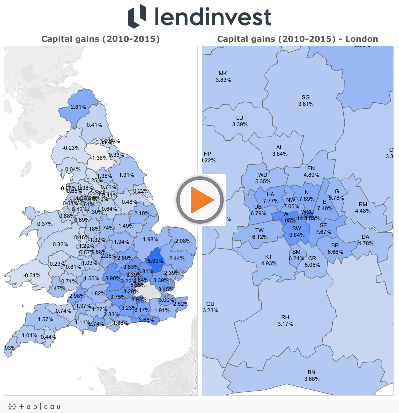
One of my latest tasks at work was to analyse data related to Brexit referendum results and the UK housing market.
Luckily, all but rental data (acquired from Zoopla) was publicly available. Property prices and rental prices needed some wrangling as Land Registry doesn’t provide information about Local Authority districts, and that was the unit used by The Electoral Commission. LA districts are not a default geographic category in Tableau (version 9.3.5) but the official blog has recently featured a post demonstrating how to use non-standard mapping.
The final result was a map (below) and a press release. This is another housing market analysis that gained a lot of media coverage, among others by International Business Times, Business Insider, and Mortgage Introducer.
I wanted to dig deeper into the relationship between the voting pattern and the housing market information so I created the following bar charts:
Once the data is visualised in this way it becomes rather obvious that the areas where house prices and the capital gains (yearly average, in the last six years) were the highest, were also the ones that were the most likely to vote remain. The situation is much more difficult to interpret when the the results are sorted by the rental yields. In that case the voting pattern is not that clear anymore.
The scatter plots (and overlapping trend lines) make it easier to see the positive correlation between the percentage of people voting remain and the following variables: median house price (2016), median rental price (2016), and capital gains (yearly, across 2010-2016). This means that as the percentage of remain voters increases, so do the variables mentioned. This relationship did not hold for rental yields where it doesn’t seem to be any relationship between the two.
The Guardian and BBC conducted similar analyses comparing voting patterns to demographic variables.
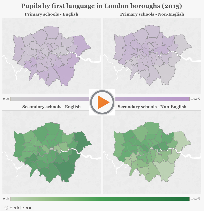
Some time ago I discovered London Datastore, a governmental data repository publishing a wide variety of interesting data sets. One of the data sets that drew my attention was describing the composition of the school population in England by first language. Being a non-native English speaker myself, I decided to see whether I could see any interesting patterns and to create a set of choropleth maps.
These maps show that the higher percentage of primary and secondary schools pupils, whose first language is English, tend to occur in the outer London boroughs, e.g. Havering, Bexley, and Bromley. On the other hand, larger percentage of pupils, whose first language is not English, can be found in boroughs in East London (with Tower Hamlets and Newham having especially large percentage).
Kaggle released another interesting data set. This time it’s a loan book of a P2P lender - Lending Club.
I had a stab at analysing it and here are some teaser charts that were created, but more can be found here.
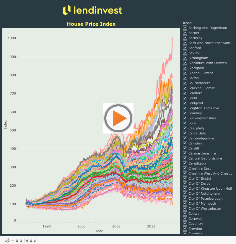
One of my work projects which gained a lot of publicity was analysing residential property sales in England and Wales. Underlying data was collected by Land Registry and is publicly available.
Land Registry also makes their House Price Index data publicly available. I used it to create the following visualization:
R has a number of libraries that can be used for plotting. They can be combined with open GIS data to create custom maps.
In this post I’ll demonstrate how to create several maps.
First step is getting shapefiles that will be used to create maps. One of the sources could be this site, but any source with open .shp files will do.
Here I’ll focus on country level (administrative) data for Poland.
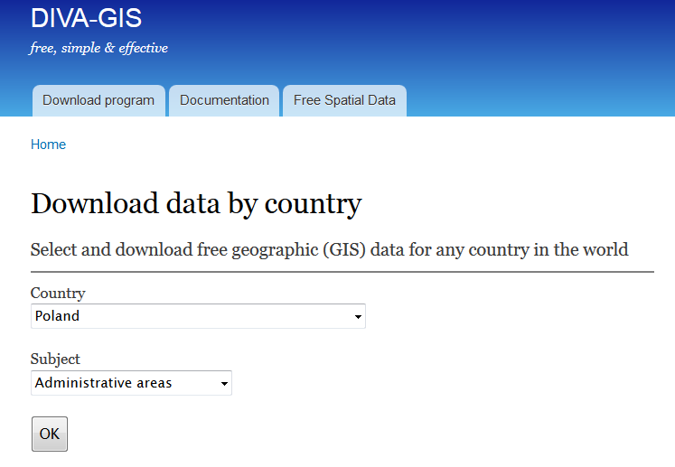
If you follow the link to diva-gis you should see the following screen:
I’ll plot powiats and voivodeships which are first- and second-level administrative subdivisions in Poland.
After downloading and unzipping POL_adm.zip into your working directory in R you will be able to use the scripts underneath to recreate the maps.
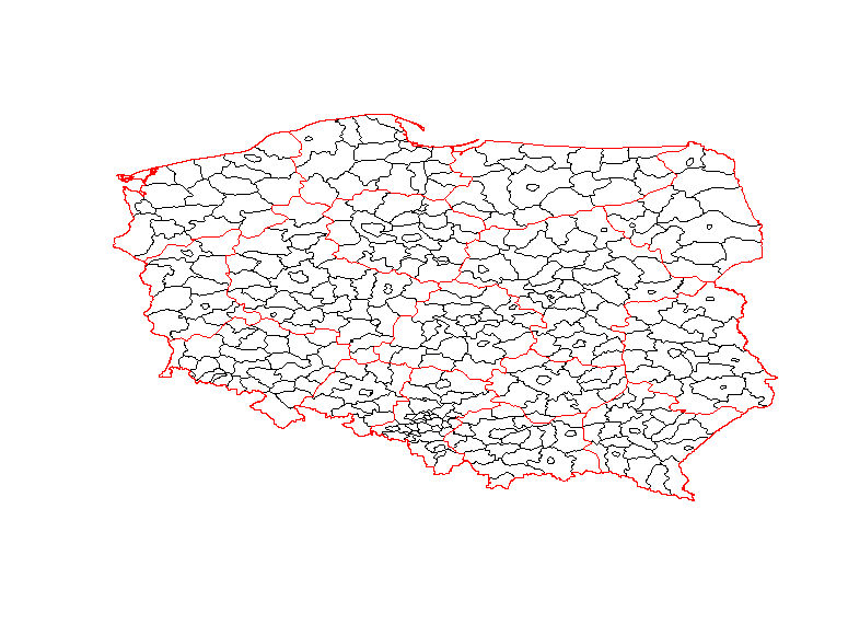
The simplest map is using only the shapefiles without any extra background.
Clearly, it’s not the most attractive map, but it’s still informative.
It was generated with the following code:
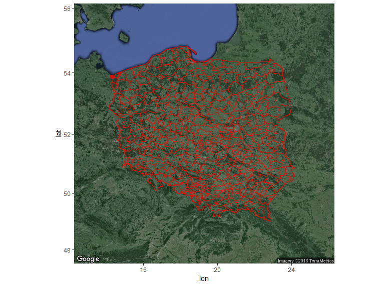
Nicer maps can be generated with ggmap package. This package allows adding a shapefile overlay onto Google Maps or OSM. In this example I used get_googlemap function, but if you want other background then you should use get_map with appropriate arguments.
Code used to generate the map above:
And last, but not least is my favourite interactive map created with leaflet.
Snippet:
> sessionInfo()

R version 3.2.4 Revised (2024-03-16 r70336)

Platform: x86_64-w64-mingw32/x64 (64-bit)

Running under: Windows 7 x64 (build 7601) Service Pack 1
Kaggle publishes many interesting datasets and one of them was including various world university rankings.
I decided to run a quick analysis of the CWUR data and create a map in R using rworldmap package.
The initial results are here: USA and China outnumber other countries by the number of universities in the CWUR data.
The map shows that USA by far outnumbers other countries in the top 100 universities according to CWUR.
Here’s the gist:
My latest script for this analysis can be found on Kaggle.
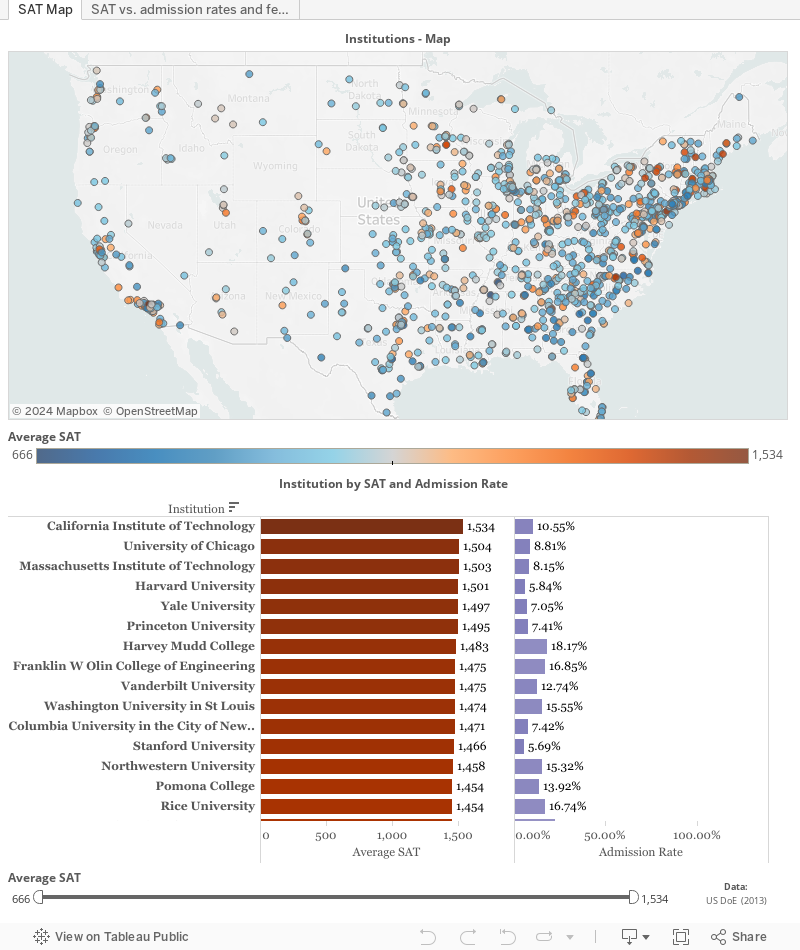
I finally found some time to crunch numbers from a Kaggle swag competition. Available dataset was rather large, but I wanted to focus on the latest data (from 2013) so I only analysed MERGED2013_PP.csv. I started filtering numbers in R but then I decided to move back to Tableau for interactive visualizations. The result can be seen underneath and I hope it’s self-explanatory.
Recently I came across an interesting data journalism project called The Migrant’s Files which collects and analyses information related to migrations. Data about the dead and missing would-be migrants was publicly available so I created a dashboard in Tableau using a Google Spreadsheet Web Connector (described in my previous post).
Here’s the result: