Scraping the Performance History at the Royal Opera House

As a fan of both open data and ROH I was excited to find the article promising that the ROH’s data might be opened. However, this article was published in 2014 and the only open data about ROH that I could find was the Royal Opera House Collections Database. Its format is far from being user-friendly, i.e. there are no cleaned csv (or even xlsx) files, but luckily the structure of the entire website is fairly predictable. This meant I managed to write a basic scraper to extract the high level performance data. Unfortunately the database only contained data for the years 1946-2012.

The result is this interactive dashboard created in Tableau:

Highlights:

    The number of performances in 1993 (159) started to approach the peak previously reached in 1951 (168 performances).
    1998 and 1999 were years when ROH was being reconstructed.
    The matinees started to become more popular in the noughties.
    1968 was the last year of performances as the Covent Garden Opera Company.
    Tosca was the most popular opera in the studied period with 187 performances.
    La bohème was the most popular matinee.
    The Kirov Opera was the third most popular company performing at the ROH with 33 appearances. After the name change to Mariinsky Theatre, there were additional four performances by this company.

Here’s the scraper code:

UK broadband speeds - embedding Tableau dashboards into Rmd files

I found a new dataset about UK broadband speeds and I started analysing it in R. However, after cleaning the data, I thought that creating a dashboard with Shiny would take me too much time so I moved to Tableau. I wanted to keep my analyses in one place so I embedded the dashboard into the output html document (see below).

Initially I thought that RMarkdown can’t generate embedded Tableau visualizations because the iframe in my report seemed blank after knitting the report. I had to open the generated in the browser to see the iframe filled with Tableau dashboard.

RMarkdown file is available here.

Brexit referendum and the housing market

One of my latest tasks at work was to analyse data related to Brexit referendum results and the UK housing market.
Luckily, all but rental data (acquired from Zoopla) was publicly available. Property prices and rental prices needed some wrangling as Land Registry doesn’t provide information about Local Authority districts, and that was the unit used by The Electoral Commission. LA districts are not a default geographic category in Tableau (version 9.3.5) but the official blog has recently featured a post demonstrating how to use non-standard mapping.

The final result was a map (below) and a press release. This is another housing market analysis that gained a lot of media coverage, among others by International Business Times, Business Insider, and Mortgage Introducer.

I wanted to dig deeper into the relationship between the voting pattern and the housing market information so I created the following bar charts:

Once the data is visualised in this way it becomes rather obvious that the areas where house prices and the capital gains (yearly average, in the last six years) were the highest, were also the ones that were the most likely to vote remain. The situation is much more difficult to interpret when the the results are sorted by the rental yields. In that case the voting pattern is not that clear anymore.

The scatter plots (and overlapping trend lines) make it easier to see the positive correlation between the percentage of people voting remain and the following variables: median house price (2016), median rental price (2016), and capital gains (yearly, across 2010-2016). This means that as the percentage of remain voters increases, so do the variables mentioned. This relationship did not hold for rental yields where it doesn’t seem to be any relationship between the two.

The Guardian and BBC conducted similar analyses comparing voting patterns to demographic variables.

Analysing US Higher Education - Fees, admission rates, and SAT

I finally found some time to crunch numbers from a Kaggle swag competition. Available dataset was rather large, but I wanted to focus on the latest data (from 2013) so I only analysed MERGED2013_PP.csv. I started filtering numbers in R but then I decided to move back to Tableau for interactive visualizations. The result can be seen underneath and I hope it’s self-explanatory.

The Migrants’ Files - Counting the dead

Recently I came across an interesting data journalism project called The Migrant’s Files which collects and analyses information related to migrations. Data about the dead and missing would-be migrants was publicly available so I created a dashboard in Tableau using a Google Spreadsheet Web Connector (described in my previous post).
Here’s the result:

Configuring Tableau Web Data Connectors on Windows 10 - using Google Sheets

Tableau Desktop 9.1 is out and Web Data Connectors are available as a new data source in this version. Luckily Tableau released several working connectors to popular web data sources and Google Sheets is one of them. Today I tried to connect to Google Sheets but I couldn’t find a step-by-step description of setting it up and the official thread lacked details about configuring WDC. It took me a while to figure out how to start using Web Data Connectors so I decided to write this tutorial which hopefully will help others to start using Web Connectors. This tutorial describes how to use Tableau web connectors hosted locally.

Before starting to use Web Data Connectors you need to activate Internet Information Services (IIS) Manager (more info available in this Stackoverflow thread).
This can be done on Windows 10 by pressing Windows key and typing Windows Features.
Then go to Turn Windows Features On or Off, and tick the box next to Internet Information Services.

Now you should be able to see IIS in Control Panel > Administrative Tools.
ISS_port_80
Open IIS Manager to check the values in Binding and Path columns. Binding should be set to *:8888 (http). Path points to a folder where the Tableau Connector files should be stored.
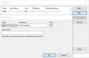
If Binding is set to a different value than 8888 (mine was set to 80 by default) then go to Actions on click on Bindings.

Then change the Port number to 8888 and click OK.
edit_site_bindings
Now your IIS Manager configuration should look like this
ISS_configuration
Check the value of the Path column. It’s set to %SystemDrive%\inetpub\wwwroot by default which in most cases means C:\inetpub\wwwroot

In order to start using Google Sheets as a data source you need to start with downloading the Web Data Connector SDK.
Unzip the zip file and go to the Examples folder.
Copy all files from the Examples folder to the Path specified in IIS. In my case it was C:\inetpub\wwwroot

Now you should be ready to start using Web Data Connectors. Go to Connect > To a server > Web Data Connector
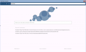
A pop-up window like the one below should appear
tableau-web-data-connector

If you copied the example files provided by Tableau to your IIS path then type the following into the address bar of the WDC pop-up window:
http://localhost:8888/GoogleSheetsConnector.html
You should see the following window
googlesheet_connector
All you need to do now is to provide a link to a Google Sheet you want to use. You might also need to log into your Google Account if a Sheet provided is private.
Now you can start using Google Sheets as a data source. Hooray!

If you need to use other connectors then just change the path in the Address bar of the pop-up window.

Article Processing Charges paid by UCL (2013-2014)

I found an interesting data source on FigShare showing how much University College London paid for the Article Processing Charges. According to the description of this data set it should include items between 1st April 2013 and 31st July 2014. However, there are some entries that are dated earlier and later than that. I guess that only the previously mentioned period is complete. I included all data anyway and then I added a linear regression line on top of the plot showing total cost by date. Judging by that, it seems like the costs keep on increasing. However, it is just a short period of time and I don’t know whether this trend held for a longer period of time.
Large journals (e.g. Nature Communications, PLOS One, and Lancet) stand out as taking more APCs than others. The vast majority of articles in this data set has been published with a CC BY licence.
Feel free to further explore the plots. They are all interactive.


Research Councils UK Diversity Data

Lately I came across a data set published by Research Councils UK (RCUK) about the diversity of grant applicants. The document didn’t include any plots, so I decided to fix that. Unfortunately, the report was only available in a pdf format which is not optimal for acquiring data.
Luckily, I came across Tabula which is an open source project that allows extracting data from tables in pdf files. With the help of Tabula I extracted data from the document to create plots. Formatting of the original document required too much data wrangling, so I only used data from the first table.
This data is showing an estimate of academic populations applying to the Research Councils.

Higher Education Salaries in the UK

Times Higher Education published a 2015 pay survey in April, but only now I found time to create interactive visualisations showing their data.

I had to edit the table to make it usable in Tableau. I removed the ‘All’ column from the original data source. This column most likely represented weighted means. I couldn’t find any information about how it was calculated, so I only used ‘Female’ and ‘Male’ values. Combined (‘All’) values used in my workbooks are means of these two fields.

I used Edubase data to find additional information about universities, e.g. region or location (available only for HE institutions in England).