Brexit referendum and the housing market

One of my latest tasks at work was to analyse data related to Brexit referendum results and the UK housing market.
Luckily, all but rental data (acquired from Zoopla) was publicly available. Property prices and rental prices needed some wrangling as Land Registry doesn’t provide information about Local Authority districts, and that was the unit used by The Electoral Commission. LA districts are not a default geographic category in Tableau (version 9.3.5) but the official blog has recently featured a post demonstrating how to use non-standard mapping.

The final result was a map (below) and a press release. This is another housing market analysis that gained a lot of media coverage, among others by International Business Times, Business Insider, and Mortgage Introducer.

I wanted to dig deeper into the relationship between the voting pattern and the housing market information so I created the following bar charts:

Once the data is visualised in this way it becomes rather obvious that the areas where house prices and the capital gains (yearly average, in the last six years) were the highest, were also the ones that were the most likely to vote remain. The situation is much more difficult to interpret when the the results are sorted by the rental yields. In that case the voting pattern is not that clear anymore.

The scatter plots (and overlapping trend lines) make it easier to see the positive correlation between the percentage of people voting remain and the following variables: median house price (2016), median rental price (2016), and capital gains (yearly, across 2010-2016). This means that as the percentage of remain voters increases, so do the variables mentioned. This relationship did not hold for rental yields where it doesn’t seem to be any relationship between the two.

The Guardian and BBC conducted similar analyses comparing voting patterns to demographic variables.

Pupils by first language in London boroughs (2015)

Some time ago I discovered London Datastore, a governmental data repository publishing a wide variety of interesting data sets. One of the data sets that drew my attention was describing the composition of the school population in England by first language. Being a non-native English speaker myself, I decided to see whether I could see any interesting patterns and to create a set of choropleth maps.

These maps show that the higher percentage of primary and secondary schools pupils, whose first language is English, tend to occur in the outer London boroughs, e.g. Havering, Bexley, and Bromley. On the other hand, larger percentage of pupils, whose first language is not English, can be found in boroughs in East London (with Tower Hamlets and Newham having especially large percentage).

My first Kaggle competition

Last month I took part in my first Kaggle competition using BNP Paribas Cardif’s data. The aim was to accelerate claims management process but my personal goal was to apply machine learning techniques.
bnp_kaggle_header
That officially makes me a Kaggler 😛
bnp_kaggle_result_eryk_walczak_2016-04-23
I used xgboost R package to implement gradient boosting. The results are out so I know there’s a long way for me to improve my ML skills. I guess that I will need to work more on feature engineering and ensembling my models in future.
bnp_kaggle_competition_result_eryk_walczak_2016-04-23

Using ESRI shapefiles to create maps in R

R has a number of libraries that can be used for plotting. They can be combined with open GIS data to create custom maps.
In this post I’ll demonstrate how to create several maps.

First step is getting shapefiles that will be used to create maps. One of the sources could be this site, but any source with open .shp files will do.

Here I’ll focus on country level (administrative) data for Poland.
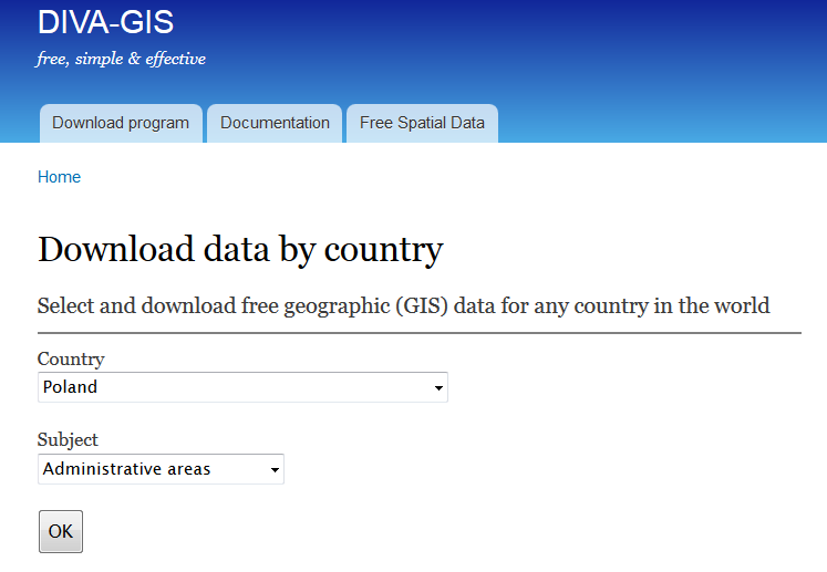
If you follow the link to diva-gis you should see the following screen:
diva-gis_poland

I’ll plot powiats and voivodeships which are first- and second-level administrative subdivisions in Poland.

After downloading and unzipping POL_adm.zip into your working directory in R you will be able to use the scripts underneath to recreate the maps.

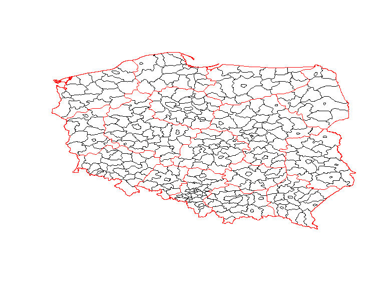
The simplest map is using only the shapefiles without any extra background.
shapefile_map_poland_1
Clearly, it’s not the most attractive map, but it’s still informative.
It was generated with the following code:

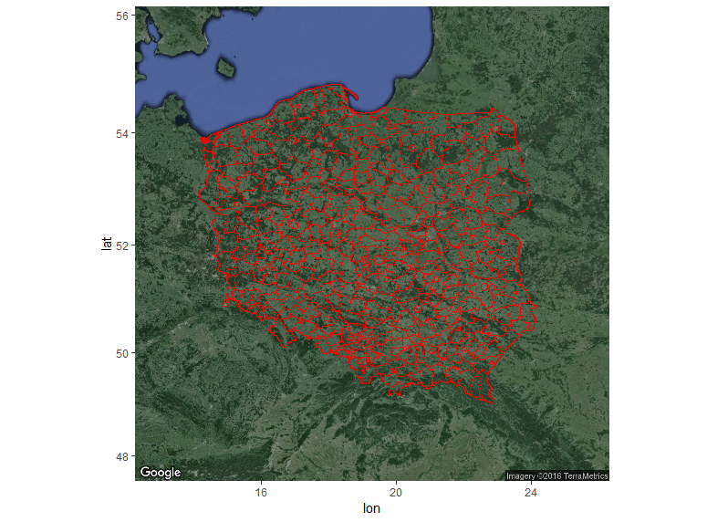
Nicer maps can be generated with ggmap package. This package allows adding a shapefile overlay onto Google Maps or OSM. In this example I used get_googlemap function, but if you want other background then you should use get_map with appropriate arguments.
shapefile_map_poland_2_google_maps
Code used to generate the map above:

And last, but not least is my favourite interactive map created with leaflet.

Snippet:


> sessionInfo()
R version 3.2.4 Revised (2024-03-16 r70336)
Platform: x86_64-w64-mingw32/x64 (64-bit)
Running under: Windows 7 x64 (build 7601) Service Pack 1

locale:
[1] LC_COLLATE=English_United Kingdom.1252 LC_CTYPE=English_United Kingdom.1252
[3] LC_MONETARY=English_United Kingdom.1252 LC_NUMERIC=C
[5] LC_TIME=English_United Kingdom.1252

attached base packages:
[1] stats graphics grDevices utils datasets methods base

other attached packages:
[1] rgdal_1.1-7 ggmap_2.6.1 ggplot2_2.1.0 leaflet_1.0.1 maptools_0.8-39
[6] sp_1.2-2

loaded via a namespace (and not attached):
[1] Rcpp_0.12.4 magrittr_1.5 maps_3.1.0 munsell_0.4.3
[5] colorspace_1.2-6 geosphere_1.5-1 lattice_0.20-33 rjson_0.2.15
[9] jpeg_0.1-8 stringr_1.0.0 plyr_1.8.3 tools_3.2.4
[13] grid_3.2.4 gtable_0.2.0 png_0.1-7 htmltools_0.3.5
[17] yaml_2.1.13 digest_0.6.9 RJSONIO_1.3-0 reshape2_1.4.1
[21] mapproj_1.2-4 htmlwidgets_0.6 labeling_0.3 stringi_1.0-1
[25] RgoogleMaps_1.2.0.7 scales_0.4.0 jsonlite_0.9.19 foreign_0.8-66
[29] proto_0.3-10

Center for World University Rankings - Kaggle dataset

Kaggle publishes many interesting datasets and one of them was including various world university rankings.
I decided to run a quick analysis of the CWUR data and create a map in R using rworldmap package.

The initial results are here:
cwur_counties_by_universities_in_the_ranking
USA and China outnumber other countries by the number of universities in the CWUR data.

map_cwur_top_100
The map shows that USA by far outnumbers other countries in the top 100 universities according to CWUR.

Here’s the gist:

My latest script for this analysis can be found on Kaggle.

Read from txt file in Praat - “File not recognized” error

Praat is a great tool for analysing speech data but lately I came across a frustrating problem. While trying to open a txt file (vector of numbers) in Praat I would get the following error message:
File not recognized. File not finished.
Praat-read-from-file-error
After consulting my fellow PhD students I discovered that what I was missing was a header enabling Praat to read txt files.
The simplest way to fix this error is to add the following header to a text file using your favourite text editor:

However, if you want to automate the process then scripting can save you a lot of time. That’s why I created a function (txt2praat.R) appending this header to the original text file and saving the output to a new text file.

You can use the function in the following way:
txtfile <- file.choose()
txt2praat(txtfile, testfile-modified)

These commands should create a txt file (testfile - modified) appended with the short header. New file can be then opened in Praat without the error message.

Analysing US Higher Education - Fees, admission rates, and SAT

I finally found some time to crunch numbers from a Kaggle swag competition. Available dataset was rather large, but I wanted to focus on the latest data (from 2013) so I only analysed MERGED2013_PP.csv. I started filtering numbers in R but then I decided to move back to Tableau for interactive visualizations. The result can be seen underneath and I hope it’s self-explanatory.