Kaggle released another interesting data set. This time it’s a loan book of a P2P lender - Lending Club.
I had a stab at analysing it and here are some teaser charts that were created, but more can be found here.


Kaggle released another interesting data set. This time it’s a loan book of a P2P lender - Lending Club.
I had a stab at analysing it and here are some teaser charts that were created, but more can be found here.
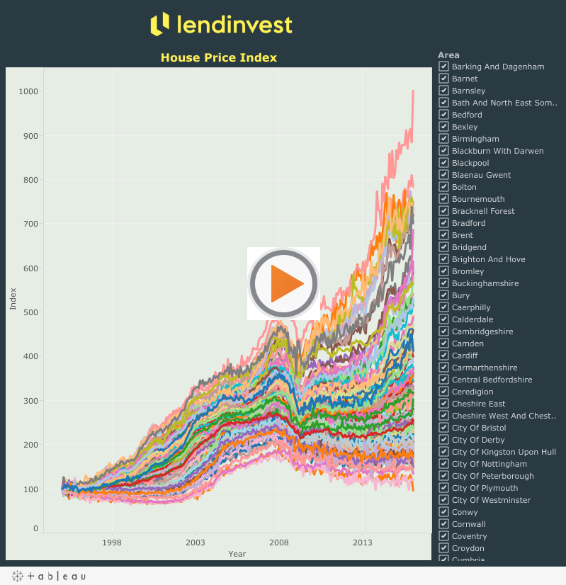
One of my work projects which gained a lot of publicity was analysing residential property sales in England and Wales. Underlying data was collected by Land Registry and is publicly available.
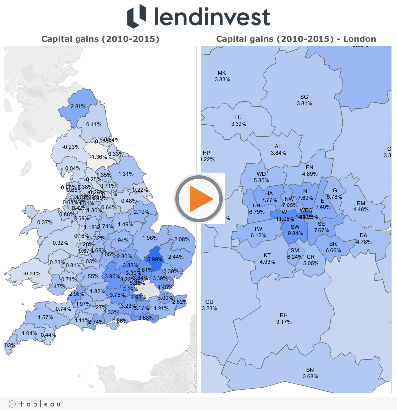
Land Registry also makes their House Price Index data publicly available. I used it to create the following visualization:
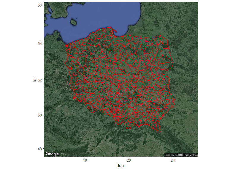
R has a number of libraries that can be used for plotting. They can be combined with open GIS data to create custom maps.
In this post I’ll demonstrate how to create several maps.
First step is getting shapefiles that will be used to create maps. One of the sources could be this site, but any source with open .shp files will do.
Here I’ll focus on country level (administrative) data for Poland.
If you follow the link to diva-gis you should see the following screen:
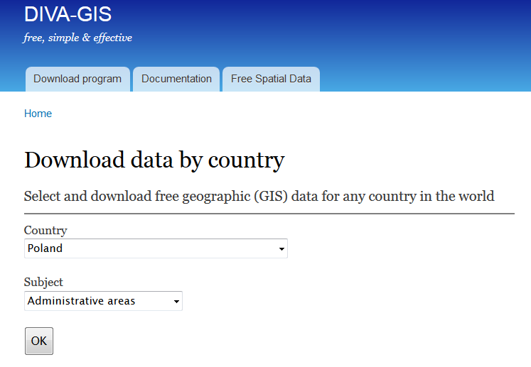
I’ll plot powiats and voivodeships which are first- and second-level administrative subdivisions in Poland.
After downloading and unzipping POL_adm.zip into your working directory in R you will be able to use the scripts underneath to recreate the maps.
The simplest map is using only the shapefiles without any extra background.
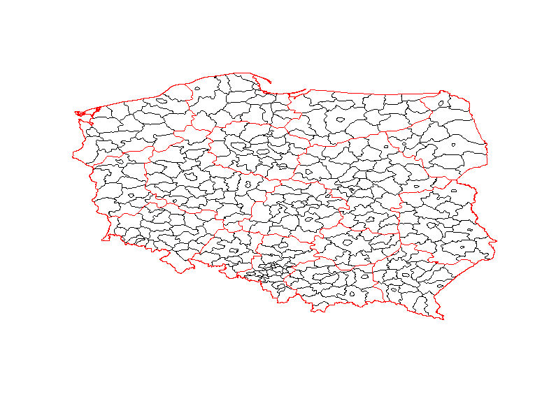
Clearly, it’s not the most attractive map, but it’s still informative.
It was generated with the following code:
Nicer maps can be generated with ggmap package. This package allows adding a shapefile overlay onto Google Maps or OSM. In this example I used get_googlemap function, but if you want other background then you should use get_map with appropriate arguments.
Code used to generate the map above:
And last, but not least is my favourite interactive map created with leaflet.
Snippet:
> sessionInfo()

R version 3.2.4 Revised (2024-03-16 r70336)

Platform: x86_64-w64-mingw32/x64 (64-bit)

Running under: Windows 7 x64 (build 7601) Service Pack 1
locale:
[1] LC_COLLATE=English_United Kingdom.1252 LC_CTYPE=English_United Kingdom.1252
[3] LC_MONETARY=English_United Kingdom.1252 LC_NUMERIC=C
[5] LC_TIME=English_United Kingdom.1252
attached base packages:
[1] stats graphics grDevices utils datasets methods base
other attached packages:
[1] rgdal_1.1-7 ggmap_2.6.1 ggplot2_2.1.0 leaflet_1.0.1 maptools_0.8-39
[6] sp_1.2-2
loaded via a namespace (and not attached):
[1] Rcpp_0.12.4 magrittr_1.5 maps_3.1.0 munsell_0.4.3
[5] colorspace_1.2-6 geosphere_1.5-1 lattice_0.20-33 rjson_0.2.15
[9] jpeg_0.1-8 stringr_1.0.0 plyr_1.8.3 tools_3.2.4
[13] grid_3.2.4 gtable_0.2.0 png_0.1-7 htmltools_0.3.5
[17] yaml_2.1.13 digest_0.6.9 RJSONIO_1.3-0 reshape2_1.4.1
[21] mapproj_1.2-4 htmlwidgets_0.6 labeling_0.3 stringi_1.0-1
[25] RgoogleMaps_1.2.0.7 scales_0.4.0 jsonlite_0.9.19 foreign_0.8-66
[29] proto_0.3-10
Kaggle publishes many interesting datasets and one of them was including various world university rankings.
I decided to run a quick analysis of the CWUR data and create a map in R using rworldmap package.
The initial results are here:

USA and China outnumber other countries by the number of universities in the CWUR data.

The map shows that USA by far outnumbers other countries in the top 100 universities according to CWUR.
Here’s the gist:
My latest script for this analysis can be found on Kaggle.
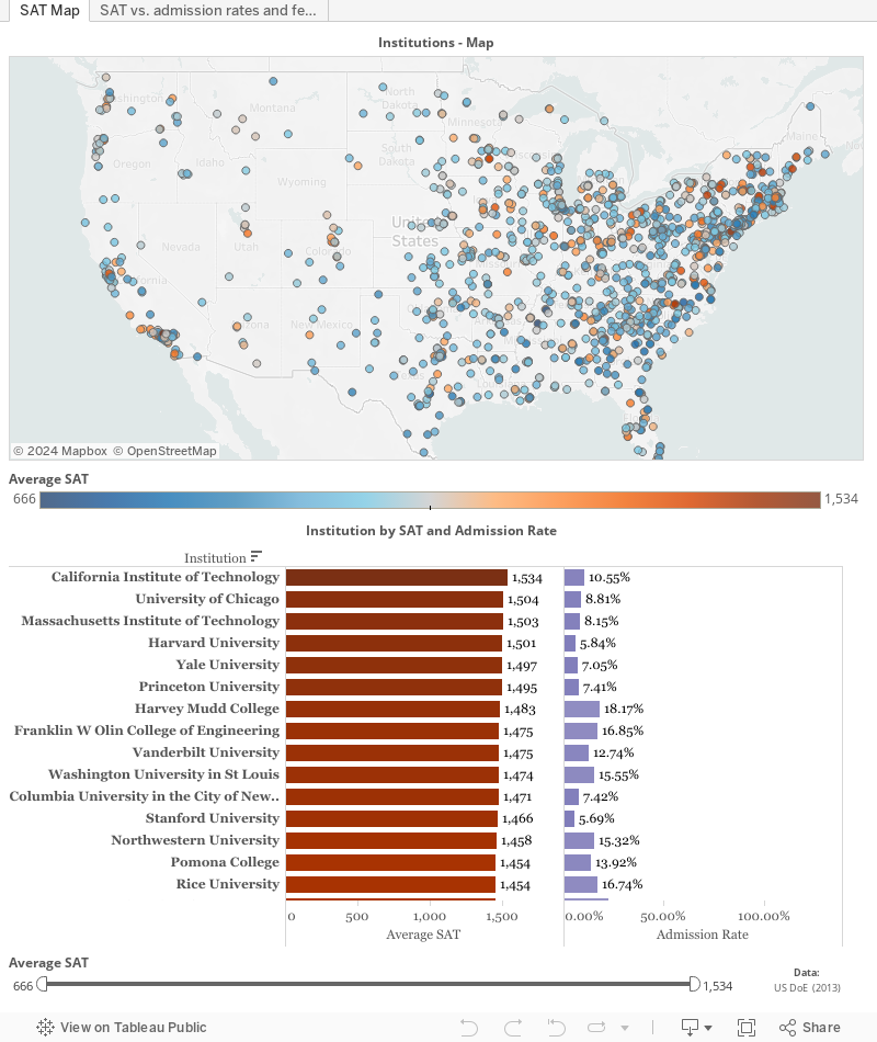
I finally found some time to crunch numbers from a Kaggle swag competition. Available dataset was rather large, but I wanted to focus on the latest data (from 2013) so I only analysed MERGED2013_PP.csv. I started filtering numbers in R but then I decided to move back to Tableau for interactive visualizations. The result can be seen underneath and I hope it’s self-explanatory.
I’m back to analysing political data after finding nicely formatted data set on one of my favourite blogs. The blog post that inspired me to do it discussed the possibility of predicting election results using polls and popularity data found online. In brief, he response is: not yet. However, with the increasing number of people using digital media and opinion polls, these channel will have more impact on the future political campaigns.
I haven’t used the actual results in this analysis but I only used the variables that came with the compiled data set. The variables in questions are: Google Trends popularity, Social Media popularity, and Opinion Polls. More details about the data can be found here (text in Polish).
After loading the data, I used the missmap function to examine the missing values. It seems like there are quite a few gaps in the data about the polls, social media, and Google Trends (in the decreasing order).

To get an overview I used tableplot from the tabplot package.

The next step was plotting time series of the individual variables.
The plots above show that the overall Social Media and Google Trends activity (dark blue line) increased closer to the election day. The averaged rating (dark blue line) of all parties in the polls seemed fairly stable. This is probably not the most interesting finding so splitting the values by party/candidate would be recommended.
Autocorrelation was conducted on the cleaned data frame (NAs were removed) to show how the variables correlate with themselves.
And here’s the code:
Recently I’ve been playing with the idea of comparing popularity of various people and ideas. I’ve previously queried Wikipedia pageviews using R but I wondered whether the same can be done with Google Trends or Google Ngrams. Both of these Google services provide interesting insights into relative popularity of various queries. Luckily for me there were other people who created fantastic connections between R and Google Trends and Google Ngrams.
One of the topics that interested me as an experimental psychologist was the changing popularity of two psychoanalysts - Sigmund Freud and Carl Jung. Knowing that psychology is becoming more empirical I expected that these two gentlemen will start losing their stardom as time goes by.
Trends extracted from Google Ngrams show the peak popularity for both psychoanalysts around 1995. The relative frequency of occurence of their names seems to decline since that time.

However, the last year recorded in the Ngram data was 2008, so things could have changed since that time. To answer this question I queried Google Trends, which shows the relative frequency of Google search terms. I didn’t set the locale in the function so I assume that the results are for global searches (but I used English spelling of the names).
The results from Google Trends support the Ngram results. Decline in popularity of both Freud and Jung can observed by using this measure.

It was just a brief write-up of my analysis so feel free to modify my code:
Recently I came across an interesting data journalism project called The Migrant’s Files which collects and analyses information related to migrations. Data about the dead and missing would-be migrants was publicly available so I created a dashboard in Tableau using a Google Spreadsheet Web Connector (described in my previous post).
Here’s the result:
Quandl is a great provider of various types of data that can be easily integrated with R. I wanted to play with the available data and see what kind of insights can be gathered using R.
I wrote a short script that collects British Pound Sterling (GBP) to Polish Złoty (PLN) historic exchange rates from 1996 till today (4th September 2015).
First thing I did was loading the libraries that will be used:
Then I downloaded the exchange rates data from Quandl. Data can be downloaded in several popular formats (i.e. ts, xts, or zoo), each appropriate for different packages.
Once I collected my data, I started cleaning the data frame that was downloaded from Quandl.
The column names designating High and Low Rates had whitespaces in them, and that could cause all sorts of problems in R. I removed ‘High_est’ and ‘Low_est’ from the xts data to make plotting with dygraphs easier. Thanks for lubridate package I easily extracted years, months, and days from the Date field. I also added a ‘Volatility’ column that showed the difference between the High and Low rates.
Now I had all my data cleaned so I could start plotting. I started by shamelessly copying the code for the Reuters-like plot that was included in Quandl’s cheat sheet.
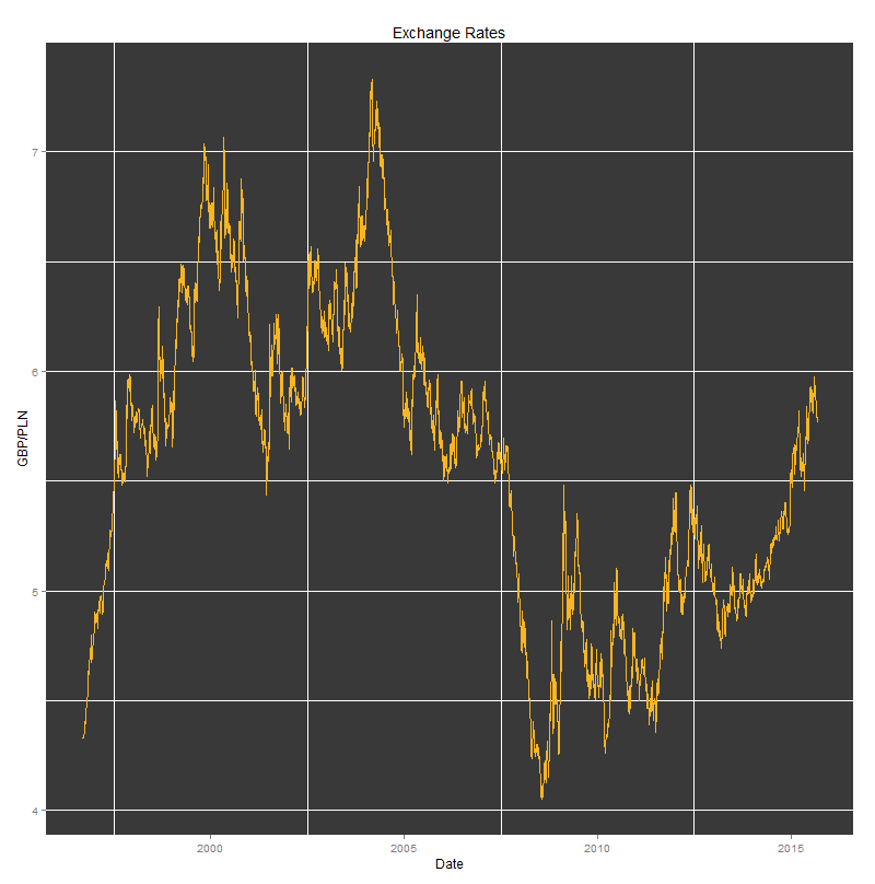
All plots were created using the following code:
The results can be seen underneath.
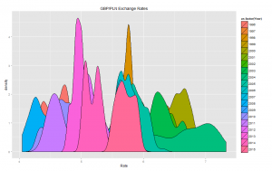
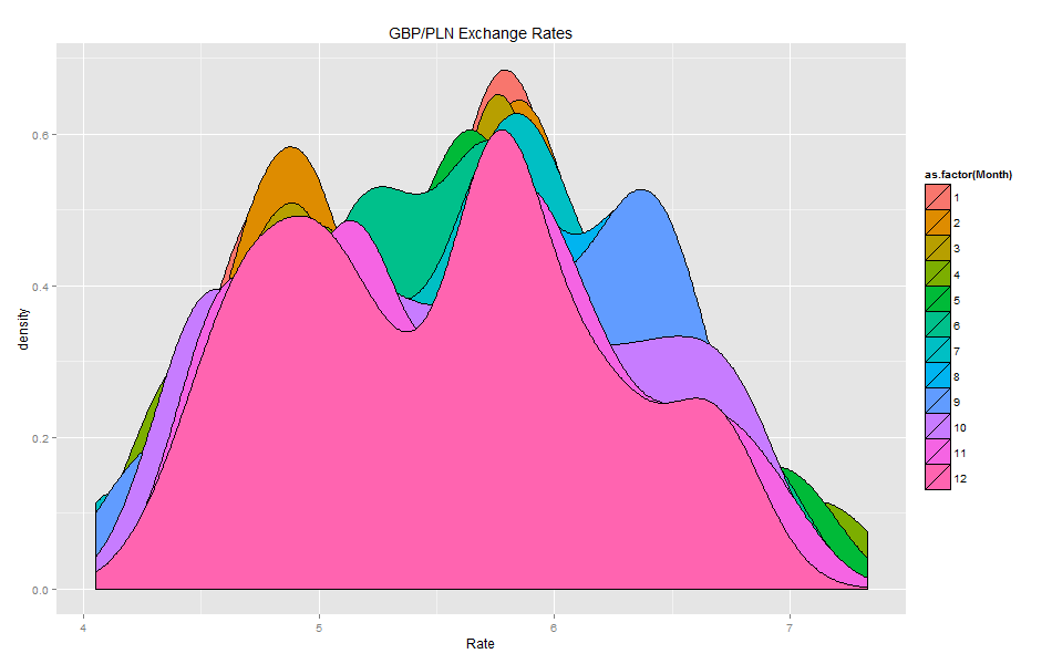
Density plots:
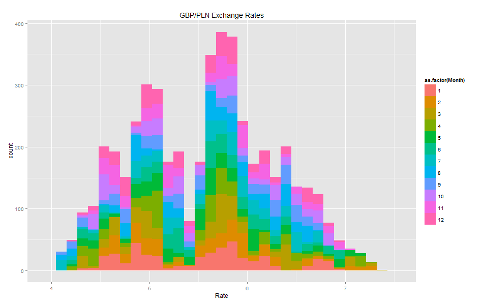
Histograms:
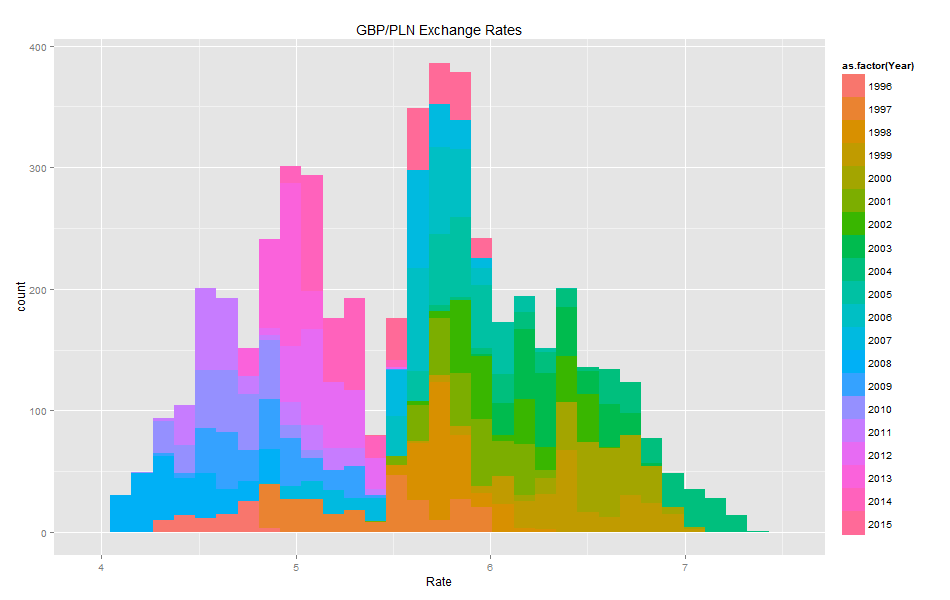
Volatility histogram shows clearly that there are many fields with missing values.
Comparing the blank fields with those containing non-zero values showed that the number of blank vs. non-blank is almost the same. This means that Volatility should not be used as it has a high number of missing values.
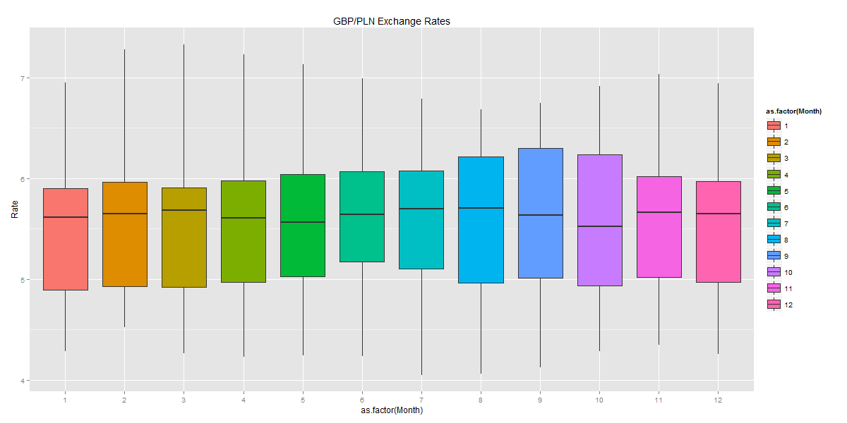
The box plots show how the GBP/PLN exchange rates fluctuate across different years and months. They also include the mean values and the variation in the exchange rates.
Last, but not least was the interactive plot created with dygraph package. That’s definitely my favourite as it allows fine-grained analysis of the underlying information (including date range selection).
I added the event lines that seemed to be relevant to the the observed maximum and minimum values of the GBP/PLN exchange rates. Around the time when Poland joined the EU, the GBP/PLN exchange rate peaked at 7.3 PLN. Four years later, just before Lehman Brothers went bankrupt, Pound Sterling was valued as low as 4.07 PLN.
The interactive plot was created using the following code:
I thought that I had enough simple plots and now was the right time for more complicated analyses. I started with the Seasonal Decomposition of Time Series by Loess using the stl function.
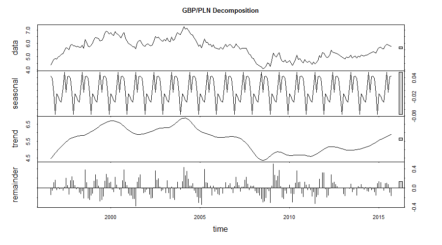
Seasonal, trend and irregular components were extracted from the underlying data. The main trend is showing the appreciation of GBP against PLN but the seasonal component might be (?) indicating approaching correction of that trend.
I wanted to finish the analysis with applying the Anomaly Detection package, that was released by Twitter’s engineering team, to my data collected from Quandl. My plan was to see whether there were any anomalous changes of the exchange rate during the recorded period.
Running this code resulted in obtaining one anomalous value, i.e. 7.328 PLN, which was the maximum value observed in the collected time series.
I hope that you enjoyed this walkthrough. In future posts I want to descibe more ways to analyse time series.
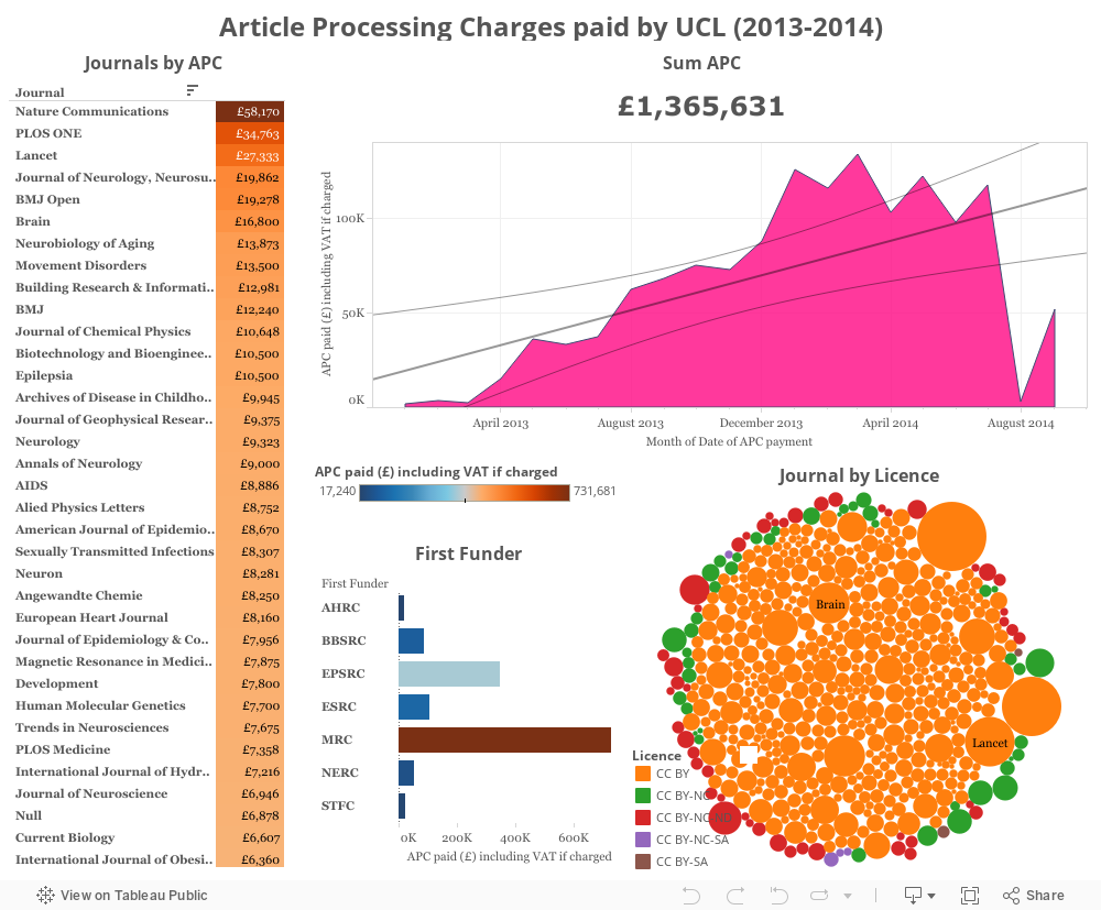
I found an interesting data source on FigShare showing how much University College London paid for the Article Processing Charges. According to the description of this data set it should include items between 1st April 2013 and 31st July 2014. However, there are some entries that are dated earlier and later than that. I guess that only the previously mentioned period is complete. I included all data anyway and then I added a linear regression line on top of the plot showing total cost by date. Judging by that, it seems like the costs keep on increasing. However, it is just a short period of time and I don’t know whether this trend held for a longer period of time.
Large journals (e.g. Nature Communications, PLOS One, and Lancet) stand out as taking more APCs than others. The vast majority of articles in this data set has been published with a CC BY licence.
Feel free to further explore the plots. They are all interactive.